Quick answer
Pantone color matching means giving your supplier Pantone codes for each color so PVC or enamel can be mixed to match your brand. Results are close but not identical to printed swatches, because material, finish and lighting affect how color looks. Supply codes, agree on tolerance, and approve a physical sample when exact color matters.
Pantone color matching is how brands keep their colors consistent across products. For custom PVC and enamel keychains, giving your supplier Pantone codes is the most reliable way to get colors that match your logo, packaging and other merchandise.
However, PVC and enamel are not paper, and a color that looks perfect on a swatch book can appear slightly different on a soft rubber charm or a plated metal keychain. This guide explains how Pantone codes are used, why small differences happen, what color tolerance means and how to approve samples so your keychains match your brand.
What Pantone Codes Are and Why They Matter
The Pantone Matching System is a standardized color reference used by designers and manufacturers. Each color has a code, so everyone works from the same reference rather than a description such as “dark blue”.
- Removes guesswork when artwork passes between designers and factories.
- Keeps colors consistent across repeat orders and different products.
- Lets you match keychains to packaging, uniforms and printed materials.
- Speeds up mockups because the factory knows exactly which colors to mix.
Screen colors (RGB) and print colors (CMYK) vary by device and printer, so they are not reliable references for physical keychains. Pantone codes are.
Coated vs Uncoated Pantone References
Pantone swatches are printed on different paper stocks, most commonly coated (C) and uncoated (U). The same code can look brighter on coated paper and softer on uncoated paper.
For keychains, specify which reference you are using, usually the coated (C) version, and send the same reference you use for your other brand materials. If you have a physical swatch book, use it when checking samples so you compare like with like.
Pantone Color Matching for PVC Keychains
Soft PVC colors are mixed from pigments and filled into each area of the mold. Pantone matching works well for PVC, but a few factors influence the result:
- Material base: PVC has its own slight tone and translucency, which can affect very light or very dark shades.
- Surface finish: glossy and matte PVC can make the same pigment look different.
- Special effects: glow, glitter, translucent or metallic effects change how a color appears and may not match a flat Pantone swatch.
- Small areas: thin lines and tiny details can look darker or lighter than large areas of the same color.
Learn more about our materials and options on the custom PVC keychains page.
Pantone Color Matching for Enamel Keychains
Enamel colors are filled into recessed areas of metal keychains. Soft enamel sits below the metal lines; hard enamel is polished flat. Both can be mixed to Pantone references, with some points to note:
- Plating affects perception: gold plating warms surrounding colors, while silver or black nickel keeps them cooler.
- Epoxy coating can slightly deepen or brighten colors beneath it.
- Hard enamel may have a narrower practical color range than soft enamel for some shades.
- Metallic and neon Pantones are harder to reproduce exactly in enamel.
For more on metal options, visit our custom metal keychains page.
Choosing Pantone Colors That Work Well on Keychains
Some colors reproduce more predictably than others on PVC and enamel. When you have flexibility in your palette, a few choices make matching easier:
- Solid, mid-tone colors such as standard reds, blues and greens usually match closely.
- Very pale tints can look slightly different because the material base shows through.
- Strong contrast between neighboring colors keeps small logos readable.
- Fewer colors make each one easier to control and check during production.
If your brand guidelines include a secondary palette, ask which colors suit the chosen material best. A small adjustment at the design stage can avoid a visible mismatch later.
Understanding Color Tolerance
Color tolerance is the acceptable difference between the target color and the produced color. No manufacturing process gives an identical match every time, so agreeing on tolerance before production prevents disputes. The table shows practical ways buyers set expectations.
| Approach | How it works | Best for |
|---|---|---|
| Visual match to swatch | Compare sample to Pantone book in good light | Most promotional orders |
| Approved physical sample | Production must match the signed sample | Retail and brand-critical colors |
| Retained reference piece | Keep a sample for repeat order checks | Repeat orders and long programs |
| Instrument measurement | Lab tools measure color difference | Strict brand programs; confirm availability |
For most keychain orders, a visual match to an approved sample is practical and effective. Write down which approach you are using in your order confirmation so both sides refer to the same standard during inspection and on any future reorder.
How to Approve Color Samples
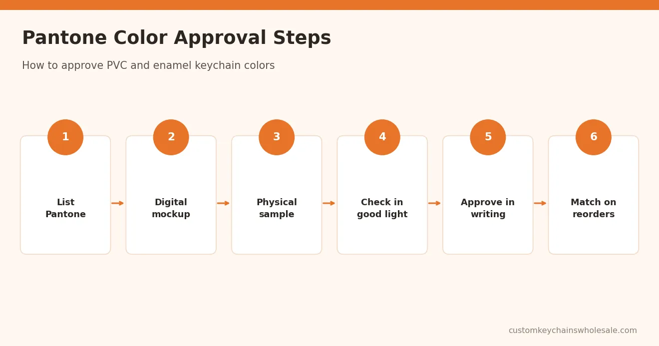
- List every Pantone code in your artwork file and brief.
- Review the digital mockup for color placement, knowing screens are only a guide.
- Request a physical sample when brand color is critical or the order is large or complex.
- Check under consistent light, ideally daylight or a neutral light source, next to your swatch book.
- Compare at normal viewing distance as well as close up.
- Approve in writing and keep the sample as the reference for production and reorders.
Our guide to digital proofs vs physical samples explains when a sample is worth the extra step.
Keeping Colors Consistent on Reorders
Color consistency across reorders is just as important as the first match. Keep your approved sample and Pantone list together, and reference them on every repeat order. Molds are kept for repeat orders, which helps keep shapes identical while colors are matched to the same references.
Include color checks in your inspection plan. Our quality inspection checklist covers how to check color, plating and print before shipment.
Common Pantone Matching Mistakes
- Supplying RGB or HEX values only, without Pantone codes.
- Mixing coated and uncoated references in the same brief.
- Judging color from a phone photo instead of the physical sample.
- Expecting neon, metallic or very light shades to match a paper swatch exactly.
- Approving without agreeing which sample is the production reference.
Avoiding these mistakes is the simplest way to get keychains that match your brand. If you work with a design agency or a promotional distributor, share the full Pantone list with them as well, so every party briefs the factory using the same references.
Get a Quote for Pantone Color Matched Keychains
Send your logo file, Pantone codes, preferred material (PVC or enamel metal), size, quantity and packaging needs. Tell us if brand color is critical so we can recommend a physical sample.
We will prepare a free digital mockup and quote. Contact us to start your order. MOQ usually starts from 100 pcs depending on material and design; confirm per quote.
Frequently Asked Questions
Can you match my exact Pantone colors on keychains?
We mix PVC and enamel colors to your Pantone references to get as close a match as the material allows. Results are typically very close, but not always identical to a paper swatch, because material, finish, plating and lighting affect appearance. For brand-critical colors, approve a physical sample before mass production.
Should I use Pantone coated or uncoated codes?
Use the reference your brand normally uses, and state it clearly. Most brands work from coated (C) references for products. The same code can look brighter on coated paper and softer on uncoated paper, so mixing the two in one brief causes confusion. Check samples against the same swatch book you specified.
Why does my keychain color look different from my screen?
Screens display color in RGB, and every device is calibrated differently, so the same file can look different on two screens. PVC and enamel are physical materials with their own texture and finish. Pantone codes and a physical sample are more reliable references than a screen or a phone photo.
What is color tolerance in keychain production?
Color tolerance is the acceptable difference between the target Pantone color and the produced color. Because no process gives an identical result every time, buyers and suppliers agree how close is acceptable, usually by approving a physical sample. That approved sample becomes the reference for production checks and future reorders.
Can neon or metallic Pantone colors be matched?
Neon and metallic Pantone colors are harder to reproduce exactly in PVC and enamel than standard solid colors. A close alternative is usually possible, and special effects such as glitter or metallic pigments may be available. Tell us which colors are important and we will advise what is realistic in your mockup.